Umbel App Redesign
WHAT IS UMBEL?
Umbel is a platform created to help marketers in the sports, media, and entertainment industries grow their fanbase, target their fans, provide them with better in-venue experiences, and sell more tickets. Umbel achieved this by allowing marketers to import all of their fan data from disparate systems and consolidate that data down to the single fan level providing a rich profile about each fan.
In the product, marketers could view how segments differed or compared to their audience as a whole to find cohorts of people to market to on Facebook, email or other social networks and then view any Facebook campaign results in the app. Umbel also helped marketers acquire new fan data via our hosted “Activations” we called Activators (later referred to as “Engagements”). These were micro-sites we hosted for our clients usually consisting of enter-to-win contests or giveaways our users could launch in just a few minutes with a goal of collecting a users information for the chance to win or receive a prize.
PROJECT BACKGROUND
I was brought on to help provide UX guidance to the team/company as a whole and to kick-start user research at Umbel. I came to Umbel during a time when the app was going through a full blown overhaul. The revamp began a few months before I arrived at Umbel. They had been leaning internally on the Client Service Team and Sales Team for feedback since they had quite a bit of experience using the product in it’s previous state, but they were itching to get some client feedback.
GOALS
Primary
- Make sure our clients “get it”. Our clients would often have trouble understanding what Umbel can do for them upon arriving to the landing page of the app. We had to remedy this first and foremost.
- Show and tell them the difference between “Audience” and “Segment(s)”. We also needed to help them understand the difference between their audience as a whole and what a segment represents as this was a core benefit to Umbel.
Secondary
- Teach them through “human-speak”. Make sure the app teaches them about their data contextually and speaks to them like an average person, not a data scientist.
PROCESS
My first task was to review the app for any potential UX pitfalls and conduct any user testing I deemed necessary. In addition, I was asked to work out any remaining features of the app that were planned to be part of the new overhaul, but hadn’t yet been worked on.
I decided to start with some internal usability testing of the new version of the app that was still in development with a wide variety of internal staff. I recruited key stake holders that used the app for clients frequently from Sales and Client Services to participate as well as some folks in marketing that had less experience with the app to get fresh eyes on it. I wanted to do these tests before any user testing since I was told our client services team actually used the app more than our users at that time (which the data in Google Analytics supported). My hope was to see if we could identify any glaring usability issues that might trip up any user, so the user sessions following this round internal testing didn’t focus too much on those issues and instead we could see if there were pain points we weren’t addressing.
After making small changes that could be done within a day or two by a front end developer on a staging environment, the plan was to conduct a round of testing with our clients with a basic goal of seeing if they understood what Umbel could do for them and their business. Once that was conducted, I would synthesize and present my findings and what changes I thought needed to be made and then tested again with another round of client feedback sessions.
DESIGN PRIORITIES
- Make sure they “get it”. This would continue to be the single biggest priority we would push going forward. I started to learn about how Umbel was sold and who actually was using the product. More often than not, these were two different people. This would often put our users in a situation where they would be seeing Umbel for the first time ever and just being told what it could possibly do for them.
- Hierarchy of key functionality should be clear. This is simply a common UX best practice, but it’s one that we could do much better at to help users understand what Umbel could do for them and use it efficiently.
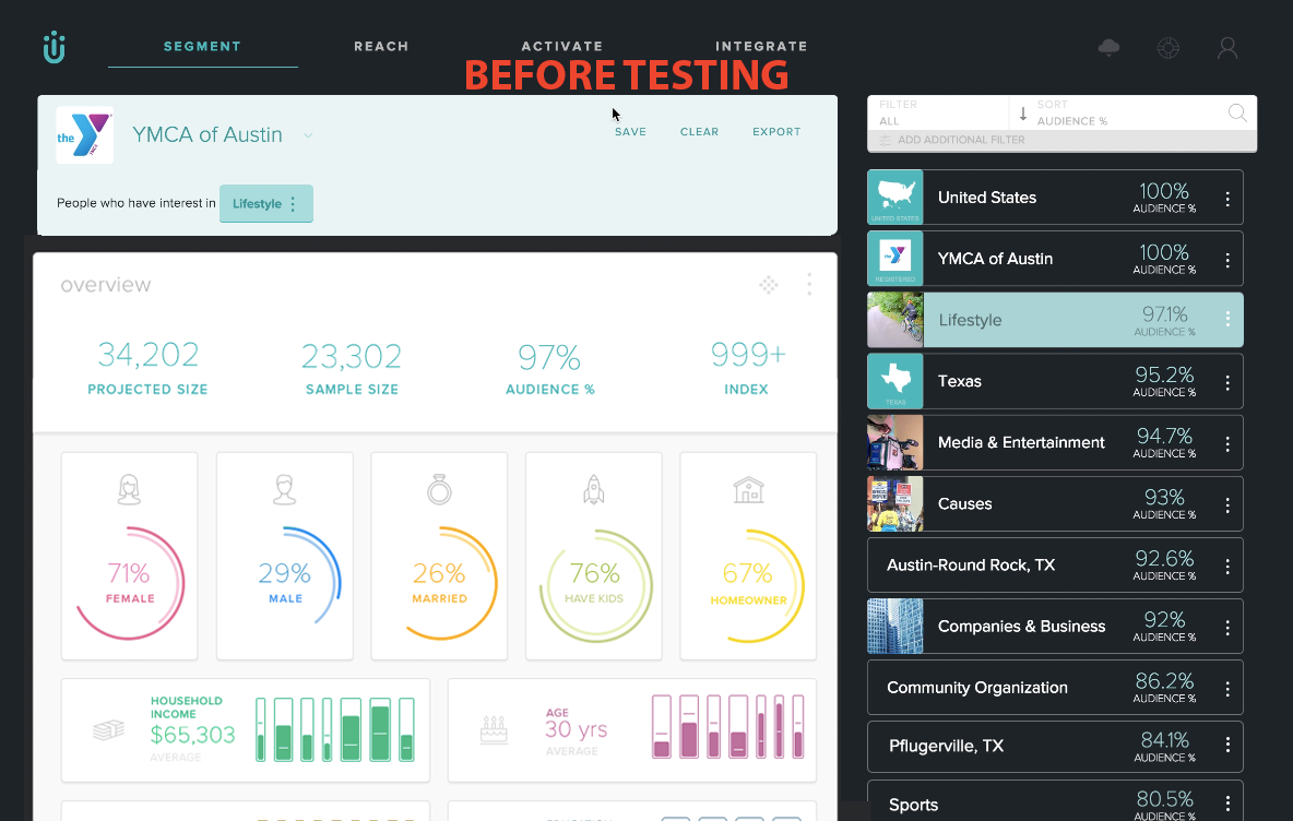
- Simplify the main segment filter. It was too complicated and not like any filter they had seen before. With this being a key component that allows users to sift through their data, it was pretty crucial to make this simple to use so they understood the hierarchy of their data and how it was structured in Umbel so they could trust that the data was correct.
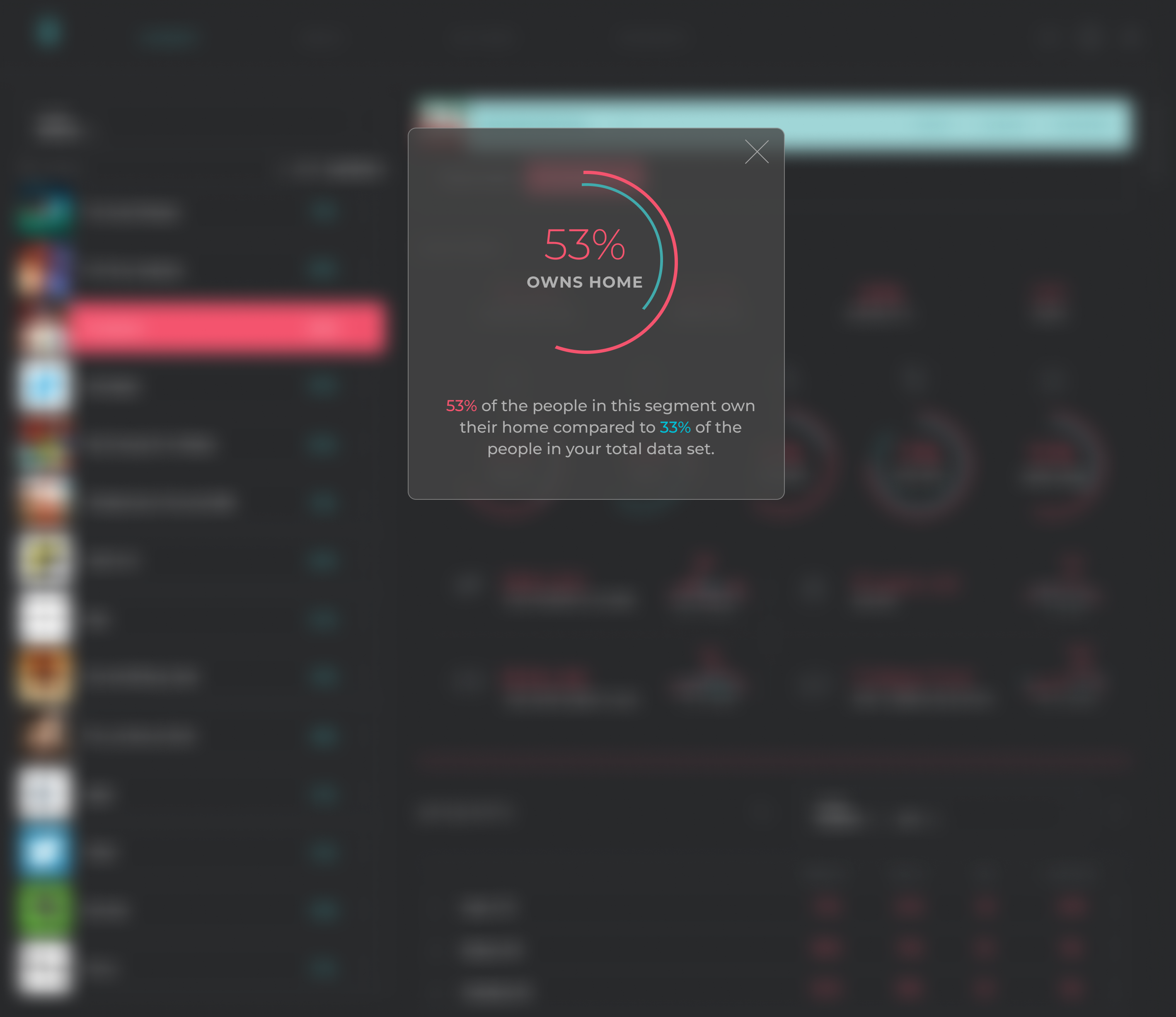
- Simplify our graphs and data representation color scheme to two colors (instead of about 12). This harkens back to helping the user easily see that the page is showing segment data versus aggregate data and it would allow us to continue this throughout the rest of the app. Changing how we visualized our 4 bar graphs at the bottom of the overview section would be needed as well based on confusion users experienced during testing.
- Guide other designer in making these changes to the parts of the app he was working on. We would both need to be on the same page in simplifying our visual contrast to improve scan-ability of the page and aid research where needed.
SOLUTION
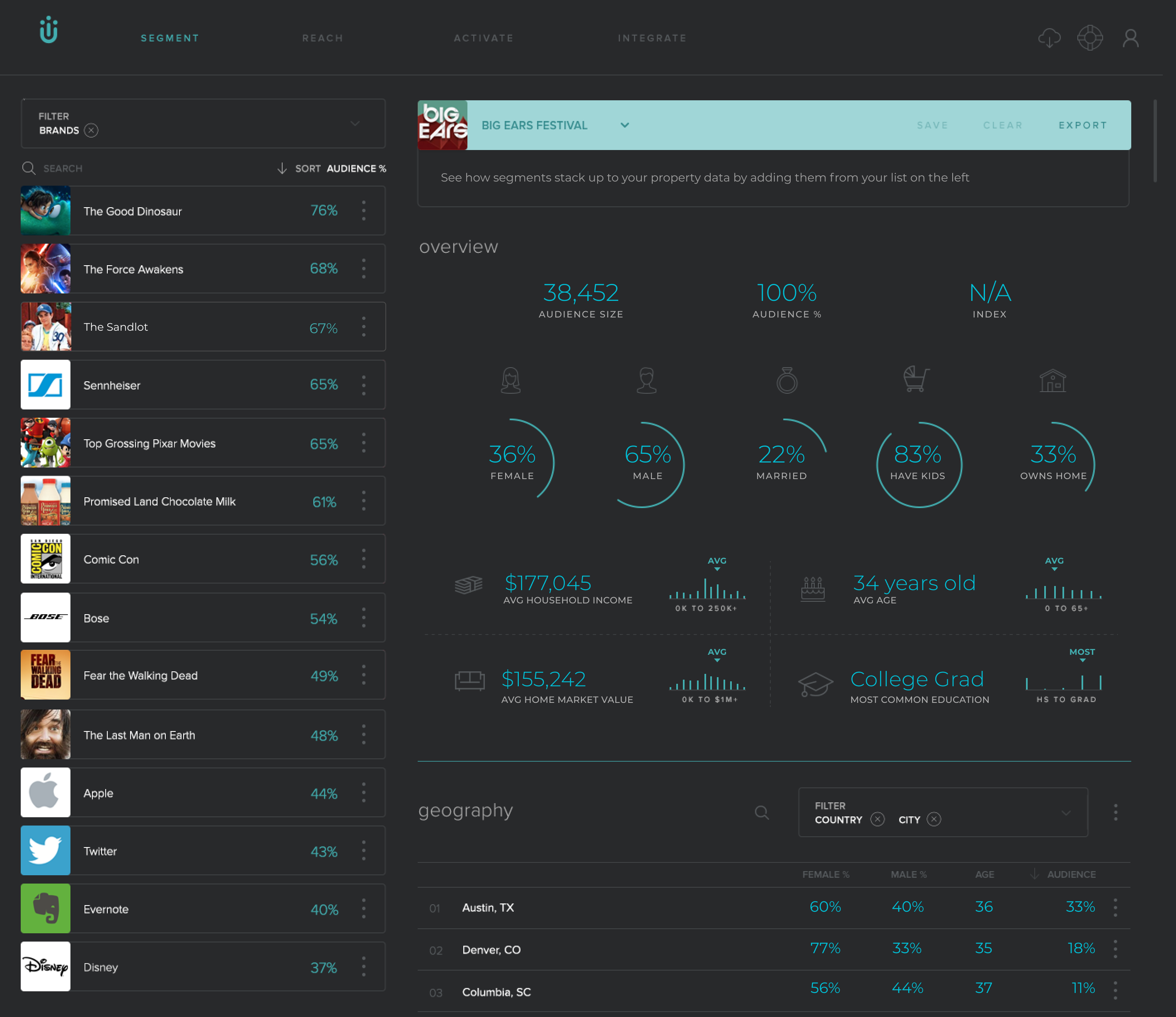
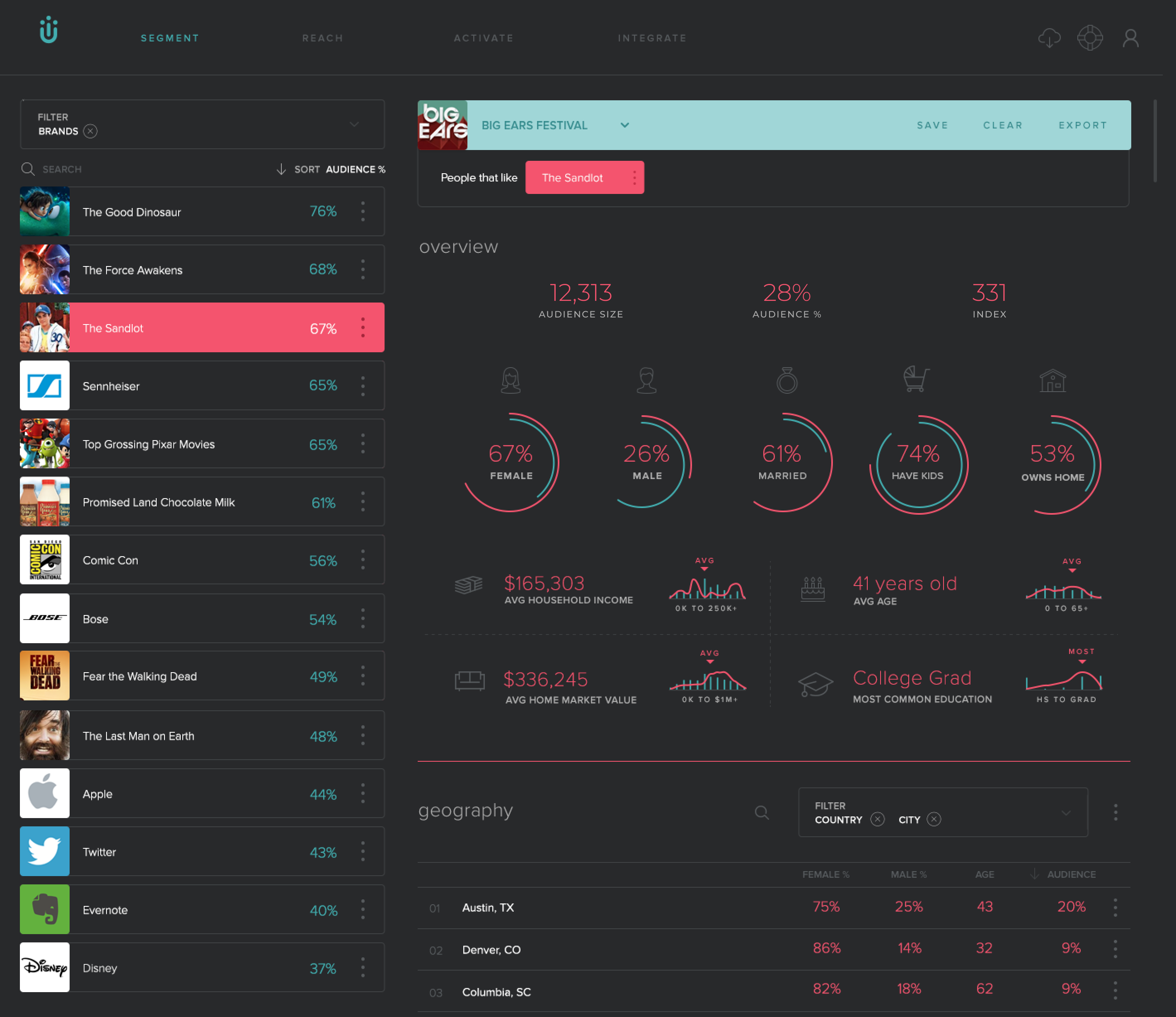
The biggest change that helped both staff and clients understand how to use the product the most was as simple as swapping the main body area and the segment list. Arranging the segment list on the left put the components that effected what was seen in the larger body area of the segmenting page first aiding the interaction relationship that clicking a segment shows how that segment is compared to the audience as a whole.
In addition, moving to a simplified color scheme with blue representing their audience data as a whole and pink representing segments helped to show to the user the uniqueness of each segment. We also moved to a darker UI to simply the look of the app as a whole and help the focus be on the differences between segments vs their audience metrics as a whole and carried this concept through the rest of the app.
A simplified filter structure also helped with understanding what data the client had imported into Umbel and the categories they could filter the segments by.
MY ROLE
- Lead UX research and design process
- Summarize insights and relay internally
- Make decisions on what to change based on research and UX best practices
- Guide other designer on changes to current design
- Create a simplified filter menu and improve graph visualizations.
- Create requirement documentation/tickets for development
- Standardize page structure for similar page types
RESULTS
KEY STATS
With the number of Visitors staying about the same we saw:
- 2X increase in Time on Site
- 3X increase in Events
- 3X increase in # of Sessions
- Filter clicks and segment clicks exploded and became the most clicked things in the app by 3 times. (This was something were determined to improve the UX of and I’d say it was quite successful.)
SCREENS