Pfluger Architects Website
PROBLEM
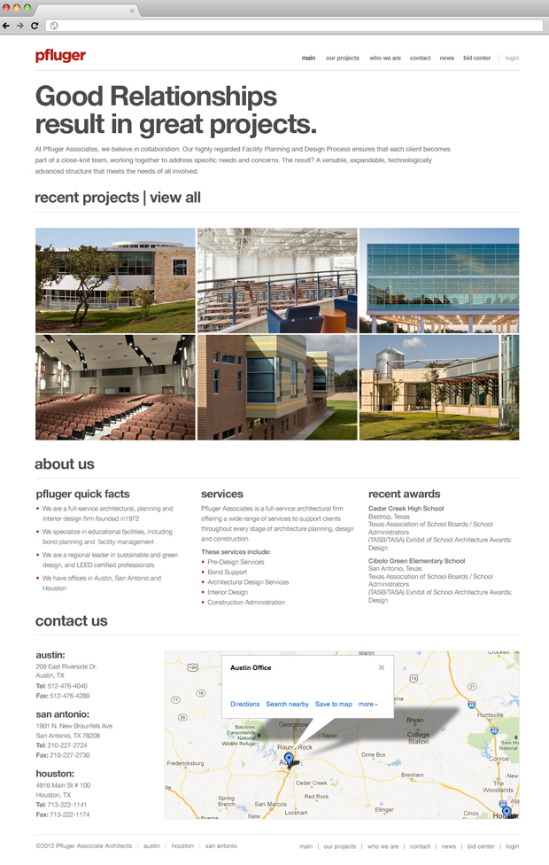
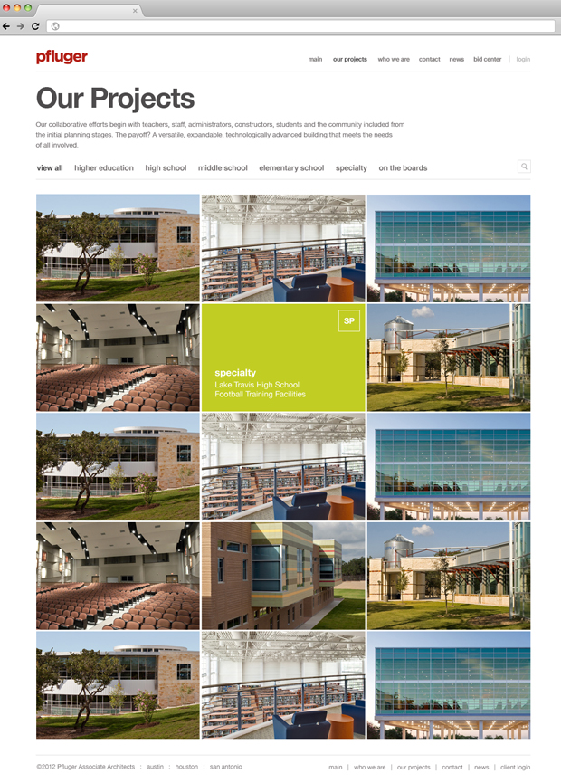
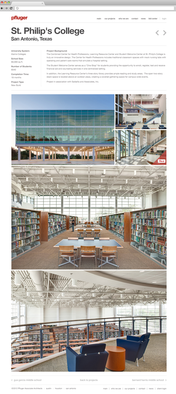
The website for Pfluger Architects was dated, the navigation was confusing, and projects weren’t presented well to showcase the level of the work they are doing. The overall experience and look of the site didn’t coincide with the style and level of work they were doing now. It needed to feel more contemporary and be a place to they can show off how impressive their work has become to potential clients and employees.
SOLUTION
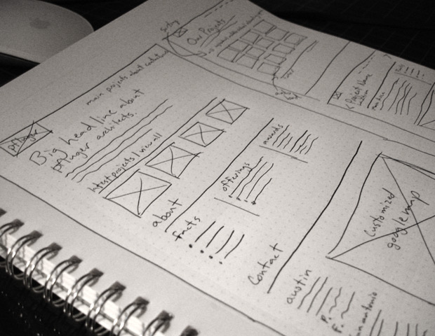
After reviewing similar architects’ websites, discussing values, style and needs with stakeholders, and even chatting with employees about what they would like the site to showcase, it was apparent that the needed to be minimalistic, simple, and make navigating/viewing their projects incredibly easy.
MY ROLE
- User Interviews
- Digital prototype review with users
- UI/UX design
SCREENS